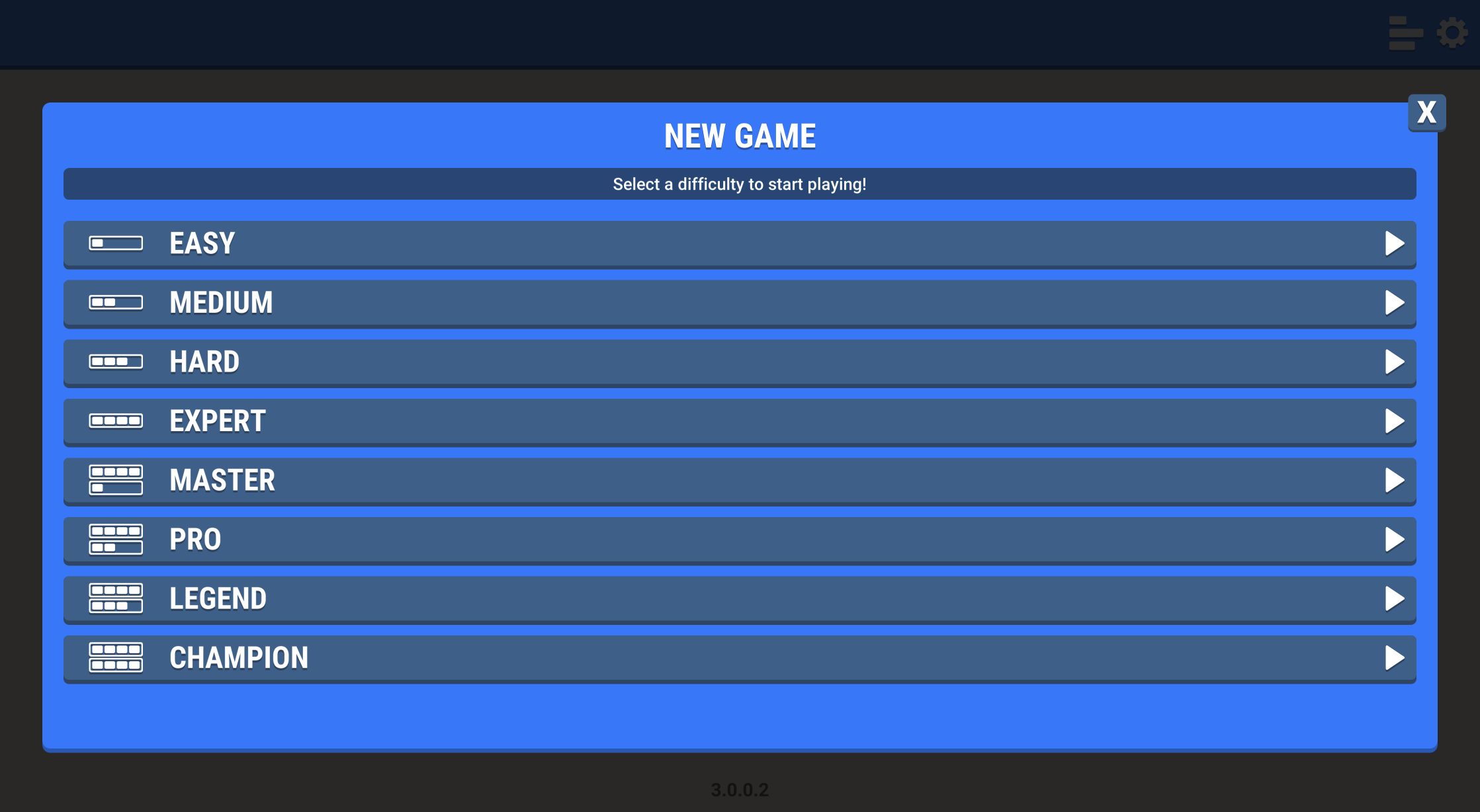
Eight Difficulty Levels Make the Menu More Ambitious Than It Looks
This browser Sudoku presents a much broader difficulty ladder than its plain opening screen suggests. New Game opens Easy, Medium, Hard, Expert, Master, Pro, Legend, and Champion in a single list. I chose Easy for the formal tests because a complete result is more useful than sampling several unfinished boards. The desktop puzzle ended in 1:19 with one deliberate mistake; the separate mobile puzzle ended in 0:41 with no mistakes.
The interface keeps the familiar rule set visible through the board itself: fill each row, column, and three-by-three box with digits 1 through 9. Given numbers appear in black, my committed entries appeared in dark blue, and the currently related row, column, or matching values received pale highlights. Those color changes made it easy to distinguish puzzle data from my work without opening a help panel.
The eight-level menu is an invitation, not evidence that every named tier has been balanced equally. I did not complete Medium through Champion, so my judgment here is about the verified Easy loop and the tools shared by the interface. Players who want a steep progression at least have clear next destinations after learning the controls.
The Easy Grid Was Readable Before I Entered a Number
The desktop board placed the 9×9 grid at the center with Easy, the timer, and a 0/3 Mistakes counter above it. Undo, Erase, Notes, and Hint sat below, followed by large number buttons. Selecting a blank cell highlighted its row and column. Selecting or entering a number also highlighted matching copies elsewhere, which reduced the effort of scanning a large display.
My opening board had 31 empty cells, enough to require real placement while remaining approachable. I transcribed the givens, solved the constraints, and entered every missing value through the visible cells and number palette. No keyboard shortcut was required for the tested loop. The game accepted click-to-select followed by click-to-enter consistently.
One small convenience became more visible near the finish: number buttons disappeared as all nine copies of a digit were completed. With only three cells left, the palette showed only 4, 8, and 9. That turns the bottom row into a quiet progress indicator and reduces accidental taps without covering the board in completion badges.

A Wrong 1 Exposed the Three-Mistake Limit Immediately
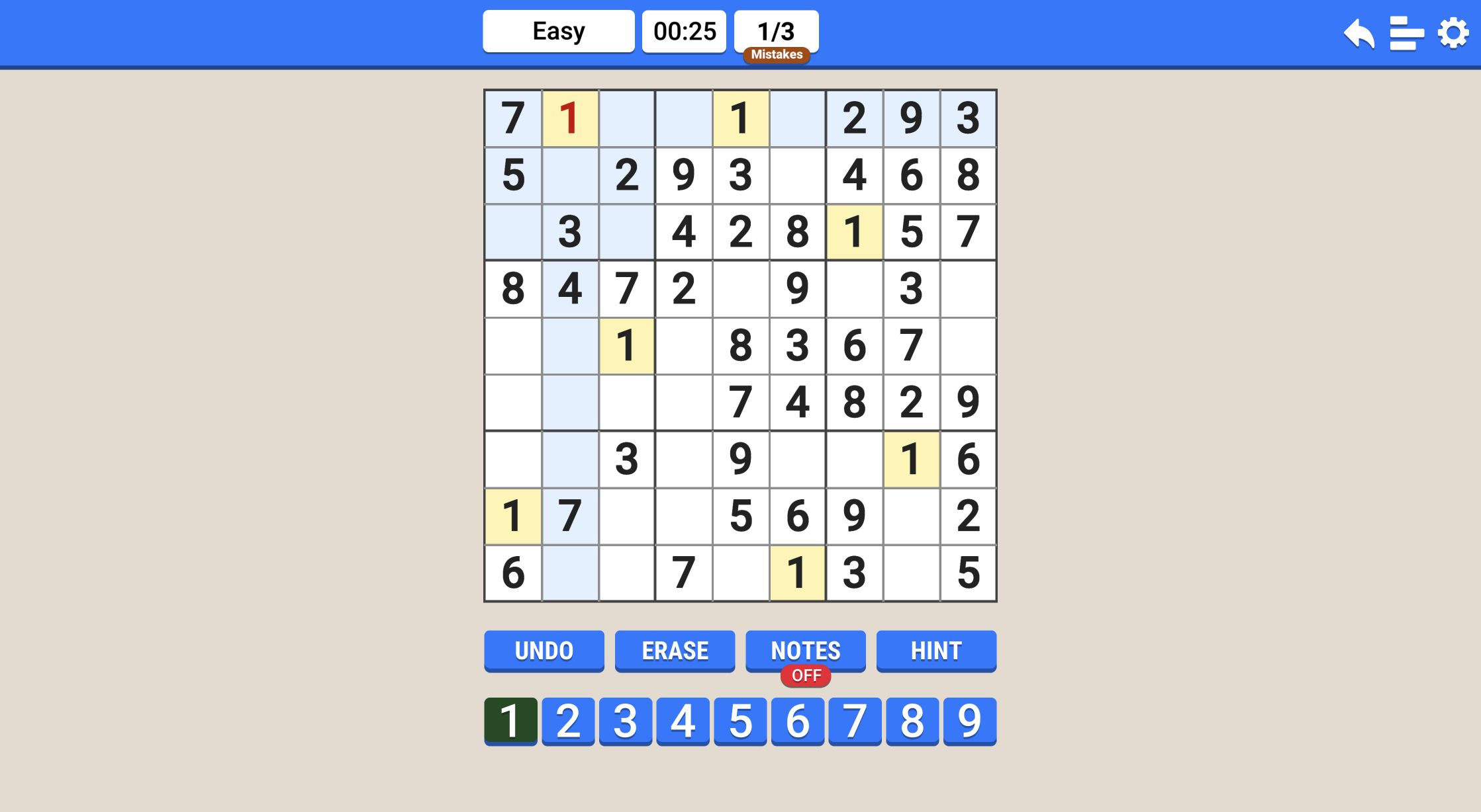
I deliberately tested failure before finishing the desktop grid. Row 1, column 2 needed an 8, but I entered 1. The wrong digit remained visible in red and the counter advanced to 1/3. The response was immediate and unambiguous, so there was no chance of building several later deductions on top of an unnoticed bad entry.
Clicking 8 while the same cell remained selected replaced the red 1 with the correct dark-blue value. The mistake count stayed at 1/3, confirming that correction repairs the board but does not refund the strike. Because the label is written as a fraction, three errors appear to be the relevant limit, though I stopped after one rather than intentionally ending a valid test board.
This error policy makes Easy less forgiving than pencil-and-paper Sudoku. It is helpful for players who want instant validation, but it also changes the solving style: exploratory guesses carry a visible cost. The better response to uncertainty is the dedicated Notes mode, which I tested next.
Notes Mode Clearly Separated a Candidate from a Final Answer
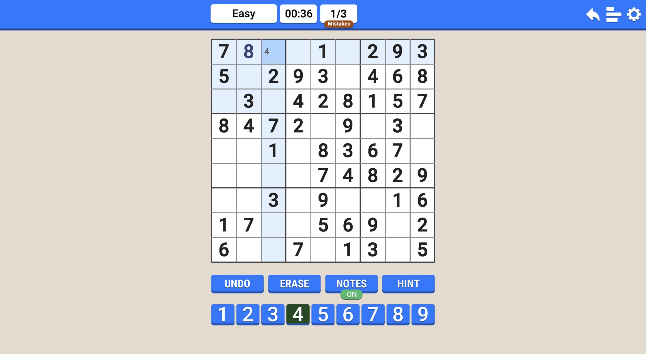
I switched Notes from OFF to ON, selected row 1, column 3, and tapped 4. A small 4 appeared in the cell rather than the full-size committed digit. The green ON label under the Notes button made the current input mode obvious. Switching Notes off and entering 4 again converted that uncertainty into the correct final value.
That two-state control is simple enough for a first puzzle but useful enough for harder tiers. The most common interface failure in digital Sudoku is forgetting that pencil mode is active and filling several cells with tiny candidates. Here the red OFF and green ON badges are positioned directly under the button, where my eyes already went before using the number row.
Undo, Erase, and Hint remained available throughout the board. I did not spend a hint during either solve, so I cannot claim whether it fills a cell, reveals a technique, or has another effect. The completion screen awarded +1 beside a lightbulb icon, which at least showed that a successful Easy puzzle replenished one hint resource.
Dark-Blue Entries Made Mid-Puzzle Progress Easy to Audit
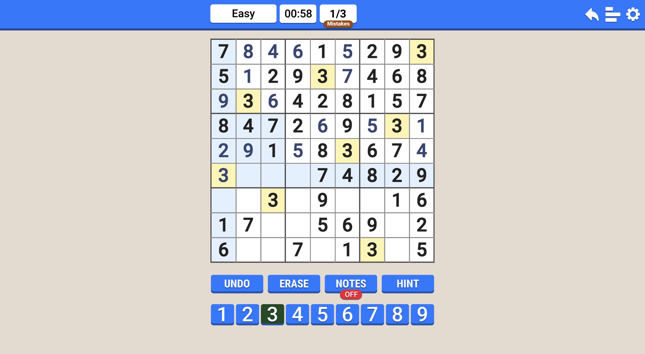
At the desktop midpoint, the first five rows were nearly complete and the lower boxes still contained open work. The board remained legible because entered values stayed dark blue while givens stayed black. Selecting a digit added yellow highlights to matching values, and pale blue shading traced the active row, column, and box. I could audit what I had changed without memorizing the original puzzle.
My practical solving sequence was to complete rows with one or two blanks, then check the intersecting columns before moving into a box. The interface encourages that rhythm because every selection exposes all three constraint areas at once. It does not explain Sudoku techniques, but it gives enough visual support to apply them without losing your place.
The timer continued running above the grid but never dominated the play area. That is the right balance for a logic puzzle: the number records a result without turning every pause into a warning. My 1:19 desktop time reflects a fully verified input sequence, including the deliberate mistake and Notes test, rather than a claim about normal human solving speed.

Both Devices Reached Solved, but Mobile Fit the Puzzle Surprisingly Well
The final desktop entry opened a SOLVED panel with Easy, 01:19, Best Time 01:19, NEW BEST, and a +1 lightbulb reward. I then repeated the full path through the local Playflaming page in a 390 by 844 mobile emulation. That second Easy grid had 31 blanks and finished in 00:41 with 0/3 mistakes, producing the same solved panel and +1 reward.
Mobile is not merely a fallback here. Portrait orientation fits the square grid, four utility buttons, and nine digits into one view. The cells are smaller than on desktop, but every number remained readable and a full touch-only solve completed without a missed control. Desktop still offers the clearest board for long sessions; mobile is the stronger fit for a short puzzle when screen space is limited.
The mobile provider path displayed third-party pre-roll ads before the build loaded. I waited or used the provider's close control without selecting any ad creative, and no ad appears in the published screenshots. This was browser emulation, not a physical-phone performance test, so the comparison covers layout, input, and completion rather than battery or hardware behavior.
The build also displays SUDOKU.COM prominently on its opening splash. This hands-on Playflaming article is independent commentary and is not an official Sudoku.com guide or an affiliation claim. On the evidence of two completed Easy boards, the game itself is a clean, readable implementation with unusually broad difficulty choices, dependable Notes feedback, and a mistake system that rewards deliberate solving.
