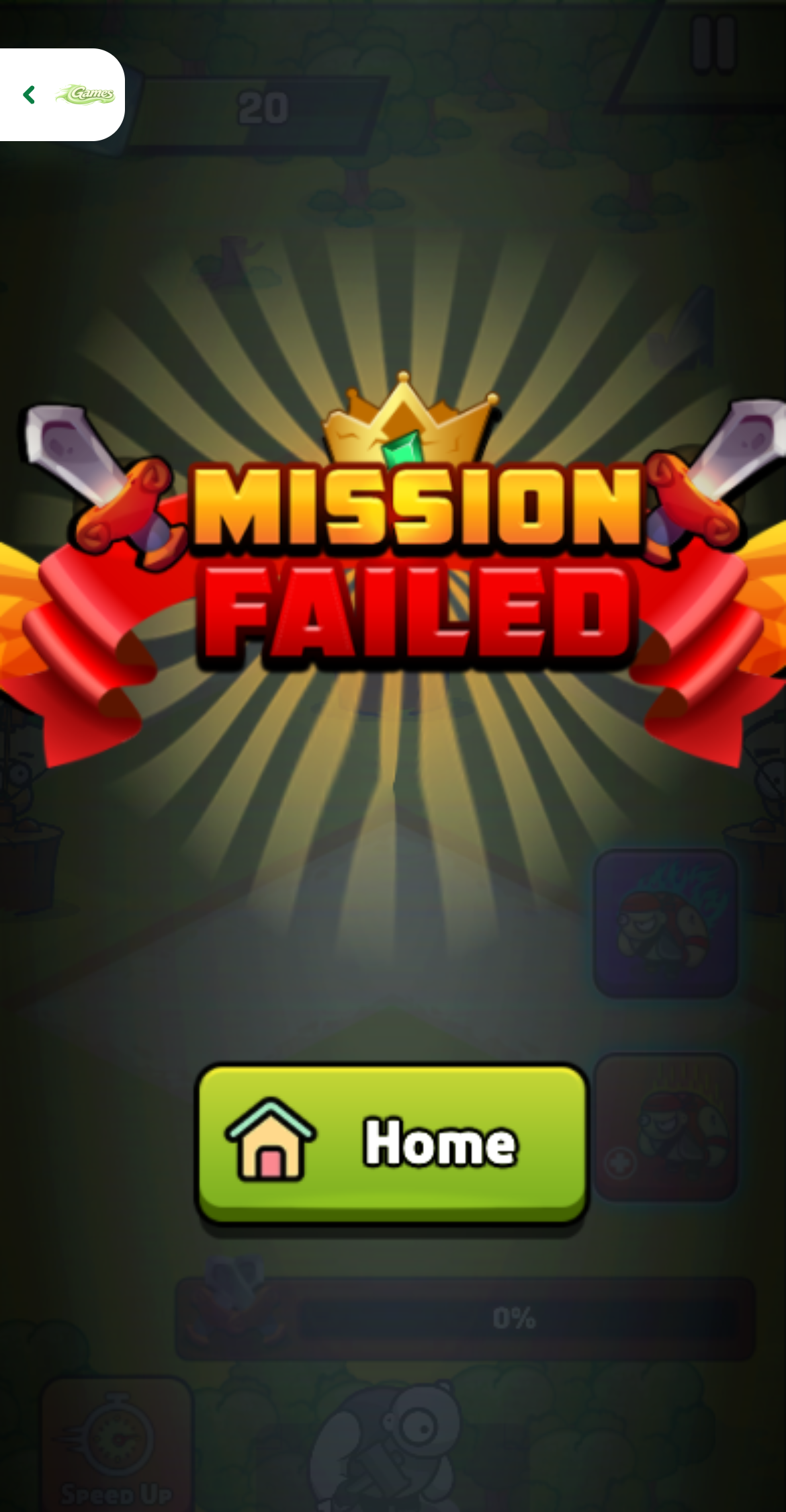
The tutorial begins with four empty training slots
Pirates Merge: War Path opened on a bright green training field with four flag-marked slots. I had 1,000 coins, ten gems, and a large recruit card priced at 100. The commander portrait explained the first action in English: tap the pirate button. This was a cleaner introduction than a menu full of modes because every important object was already on the board.
The top-left counters also previewed the longer economy. Recruited pirates increase passive coin income per second, objectives sit across the top, and a second unit track for flying creatures is visible but initially empty. Even before the first battle, the game frames expansion as a combination of roster strength, production, and limited board space.
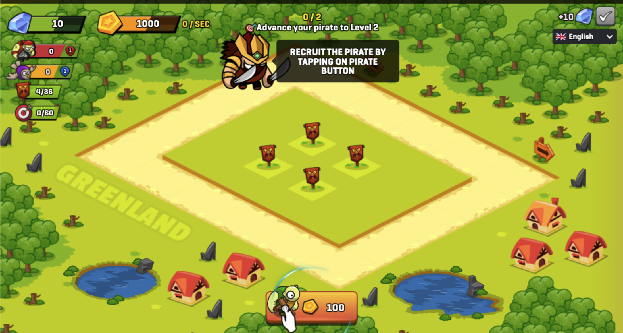
Recruit prices rise while the army earns coins back
The first pirate appeared with a level-one marker and added one coin per second. By the time the tutorial asked for another recruit, the next button showed 127 coins and my balance had already ticked back to 905. That interaction between rising prices and passive income is the early pacing mechanism: waiting helps, but each new body costs more than the last.
I liked that the game showed the income rate directly beside the balance instead of hiding it in a statistics panel. The feedback over each recruited unit also displayed a small +5 coin burst. The numbers are not complicated at this stage, yet they make each tap feel like both an army decision and an investment in future purchasing power.
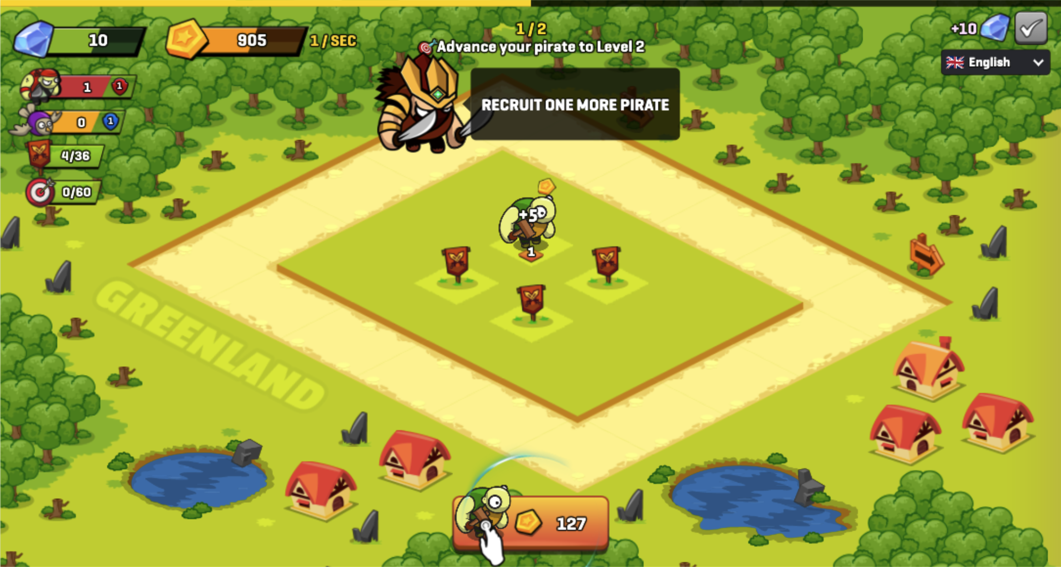
The first merge is a drag, not a button press
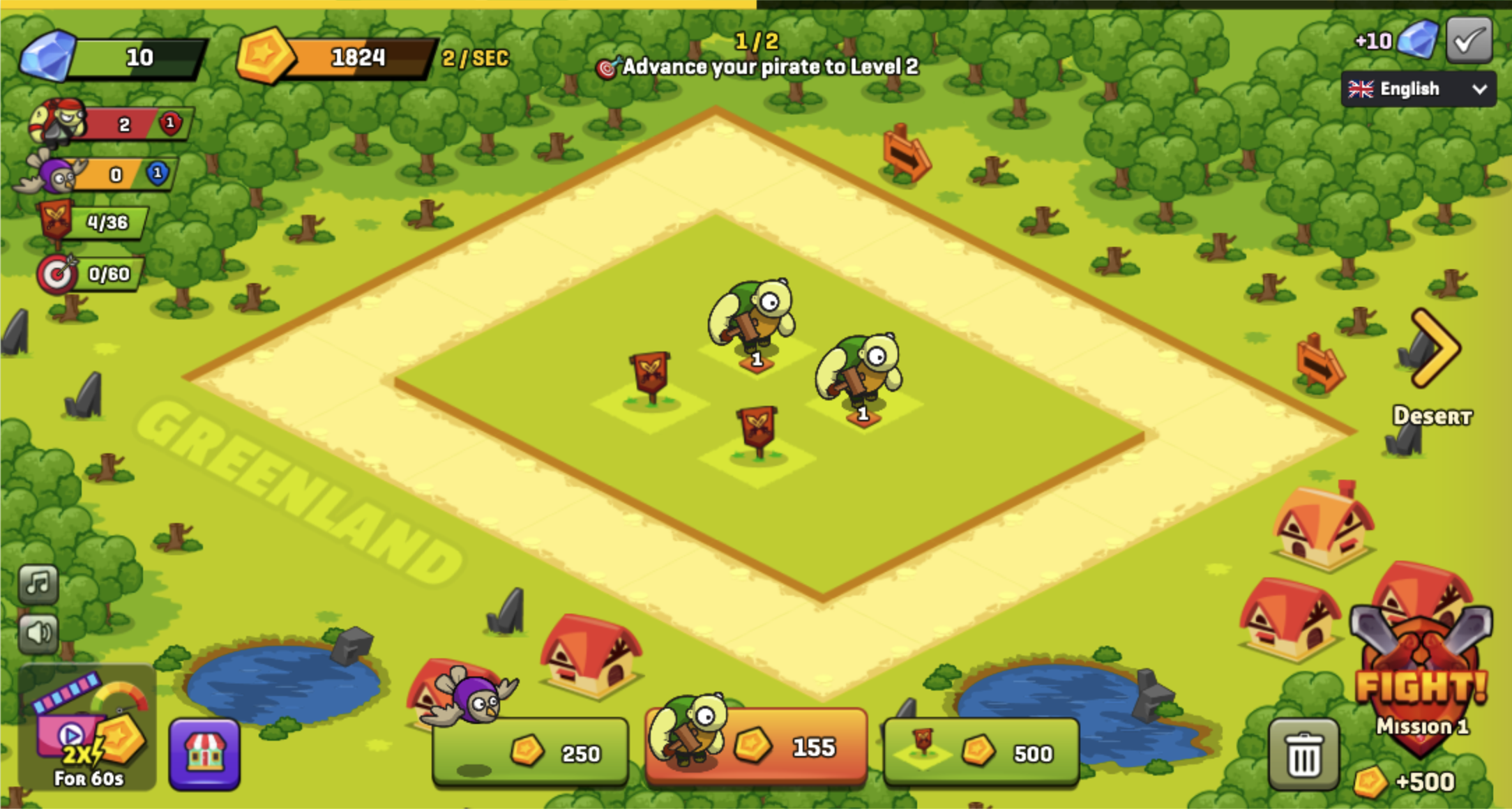
With two matching pirates on the board, the tutorial changed from tapping to dragging. I moved one level-one unit directly onto the other to advance the training chain, then continued recruiting so the mission screen would have enough bodies to deploy. The card price shown at this point was 155, another visible reminder that replacing merged units becomes steadily more expensive.
Dragging made the merge feel deliberate, but it also exposed the first input wrinkle. The board wants a clean press, move, and release over another occupied slot; dropping beside the target simply rearranges the formation. On a large desktop canvas the slots were easy to distinguish. I did not repeat this merge step in the later mobile session, so the touch evidence below is limited to battlefield deployment rather than roster preparation.
Mission 1 turns the roster into four separate deployments
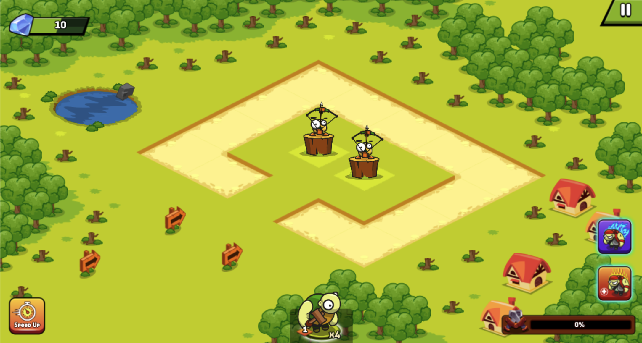
The Fight button for Mission 1 advertised a 500-coin reward. Entering it replaced the merge grid with a winding path, two archer towers, a pause button, two power-up icons, and a squad counter at the bottom. My battle roster contained four level-one pirates. They did not march automatically: the battlefield waited at zero percent until I tapped the field to send one forward.
That deployment rule is easy to miss because ordinary desktop mouse clicks did not initially register in my isolated browser session, while touch events did. Once the tap landed, one pirate advanced toward the tower and combat resolved automatically. There is no manual sword swing or target selector; your agency is deciding when to commit the next body and how strong the roster was before entering.
Two archer towers cost pirates, but the progress bar reached 100%
The first deployed pirate eventually removed one archer tower, moved the mission bar to 50%, and reduced the waiting squad from four to three. The screen then paused in a useful tactical state: one enemy remained, a red marker showed the cleared position, and I still had enough attackers to continue. Sending more units completed the second half and filled the bar to 100%.
The action is visually charming rather than strategically deep in this first mission. Pirates bunch around the wooden tower, tiny health bars fall, and exaggerated impact effects make the outcome readable. The meaningful strategy happens earlier through merging and recruitment. If an army is underpowered, repeated battlefield taps only feed units into the same defense.
The first win paid 500 coins without requiring the ad bonus
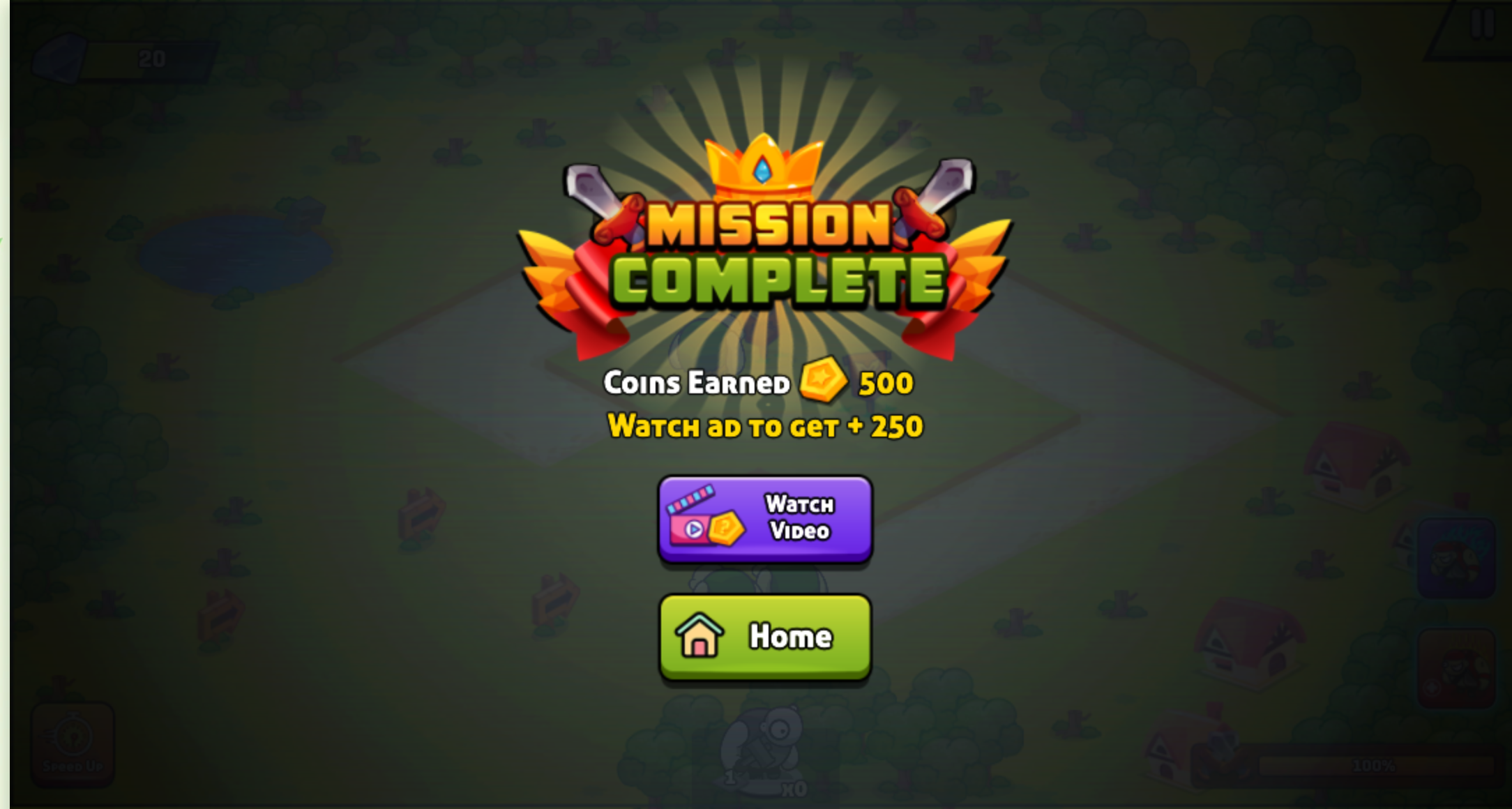
The result screen matched the promise on the Fight button: Mission Complete and 500 coins earned. A purple Watch Video button offered another 250, while a green Home button returned to the training field. I used Home and kept the base reward. This is a clearer choice than an ad prompt disguised as the only continue button, although the bonus remains visually prominent.
Ads were still part of the broader session. The Playgama launch flow showed a preroll before the game, and moving from the home field into the next mobile mission produced another timed break. Both eventually exposed a close control; I did not click the ad creative or use the rewarded boosts. Players should expect interruptions around transitions even though the result bonus itself is optional.
The mobile modal showed a cramped three-tower Mission 2
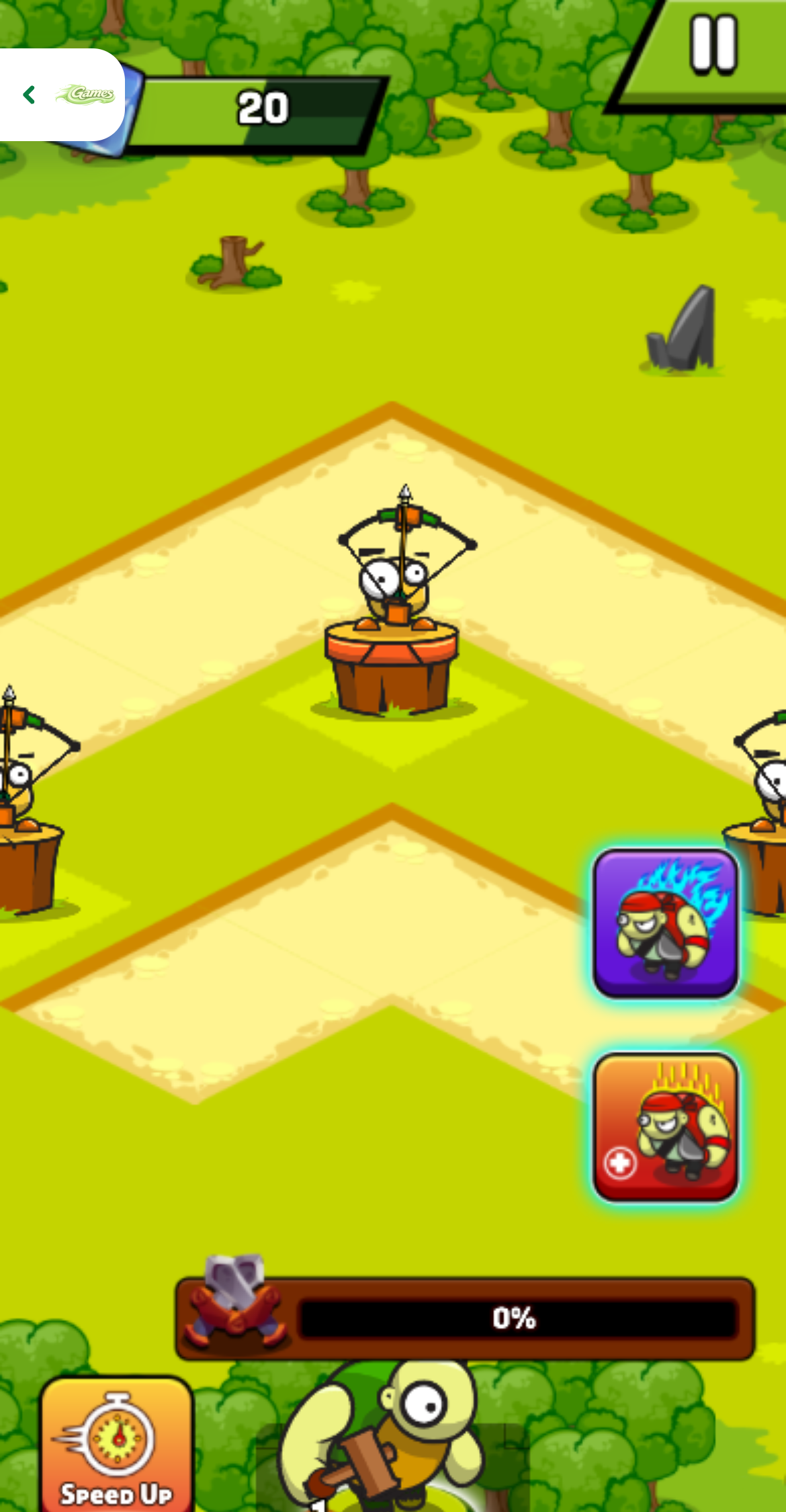
For the mobile check, I opened the local page at 390 by 844 with device pixel ratio 3, tapped Play, passed the Playgama Let's Play screen, and verified the fullscreen modal by its persistent Exit game control. The saved progression opened Mission 2 with three archer towers on the path and the progress bar at zero percent.
The portrait modal kept the central tower readable, but the landscape battle was enlarged vertically enough that part of the lower interface fell outside the visible game area. The retained start frame shows the Speed Up control only partially and does not preserve a readable squad badge. That is an observed mobile-layout limitation, so the exact roster count below comes from the completed test ledger rather than from this screenshot.
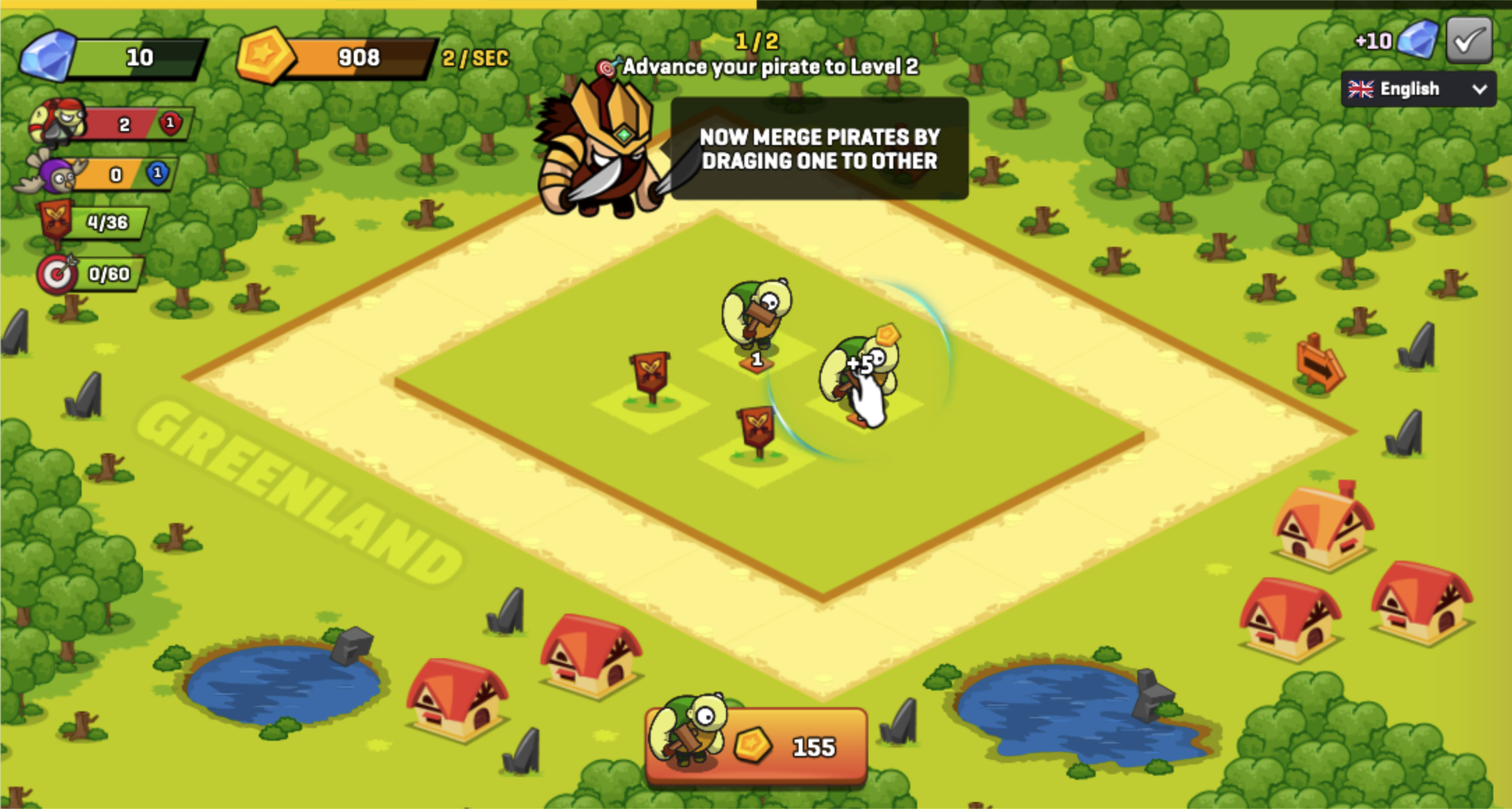
Mission 2 ended at zero percent after the basic squad was spent
The session ledger recorded four level-one pirates at the start. Repeated touch deployments spent that basic squad, but none of the three towers fell and the result was Mission Failed with progress still at zero percent. The failure overlay and Home button were clear even though the underlying lower HUD remained partly clipped.
That defeat is more informative than another easy win: the second mission punishes entering with an undeveloped roster. Touch input was the reliable way to deploy, but I did not replay the same mission on both platforms. Because desktop covered Mission 1 and mobile covered the harder Mission 2, I am not claiming one device is better. The tested takeaway is simpler: build and merge before advancing, and do not assume an unupgraded squad will brute-force the next map.