The front garden is a toy box before the door even opens
My session began outside a yellow two-storey house, with the mother, baby, and father already arranged on the path. Paint pots line the fence, a watering can rests near the door, a pinwheel stands in the garden, and seed packets fill an open wall cabinet. Nothing announced a win condition or a checklist. The scene instead works like a physical dollhouse spread: the interest comes from deciding what to pick up, whom to move, and which doorway to investigate.
I used the blue front door to begin a simple family scenario rather than trying to turn every prop into an objective. That freedom is the central appeal, but it also defines the learning curve. Players expecting arrows and missions may wonder what counts as progress. Here, progress is the visible change you create. My representative loop was modest but complete: enter the home, explore a side activity, gather lunch from the kitchen, and place a family member at the table.

The living room teaches navigation through its open edges
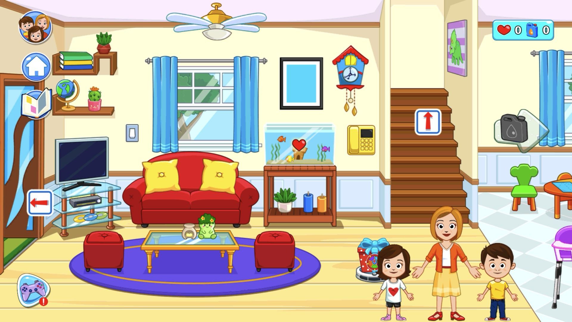
Inside, the living room immediately showed how the house is connected. A red sofa and aquarium anchor the center, stairs lead upward, and the kitchen remains visible beyond the right edge. Arrow controls and the partial next room encouraged me to move sideways rather than treat each room as a separate menu. The family arrived near the stairs, so I could keep the characters together while inspecting the furniture and small gift-like object on the floor.
This continuous layout makes the home feel more like one play set than a collection of minigames. It also rewards visual curiosity: the television, fish tank, clock, telephone, candles, and doorway all compete for attention without tooltips. I appreciated the lack of interruptions once inside. The tradeoff is that the screen can become busy, especially when movable characters overlap furniture. A deliberate click or drag is more reliable than quickly sweeping across a cluster of props.
The storybook turns household scenes into silhouette prompts
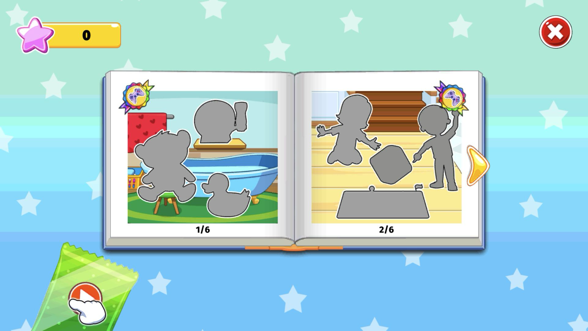
Before continuing to lunch, I opened the book control on the left. It revealed an album-like spread with gray silhouettes placed over familiar rooms. The visible pages were numbered 1/6 and 2/6: one showed bathroom objects, while the other showed figures and shapes in the living room. That creates a more directed layer for players who want a prompt without changing the house into a conventional level map.
The silhouettes communicate by shape, so even a young player can compare the empty outlines with characters and props in the home. At the same time, the book does not explain every step in text. I treated it as an optional idea generator and closed it after inspecting the first spread. It is a useful bridge between free play and collection, but the opening pages also suggest that completing every outline will require patient object matching across several rooms.
Opening the refrigerator creates a convincing kitchen inventory
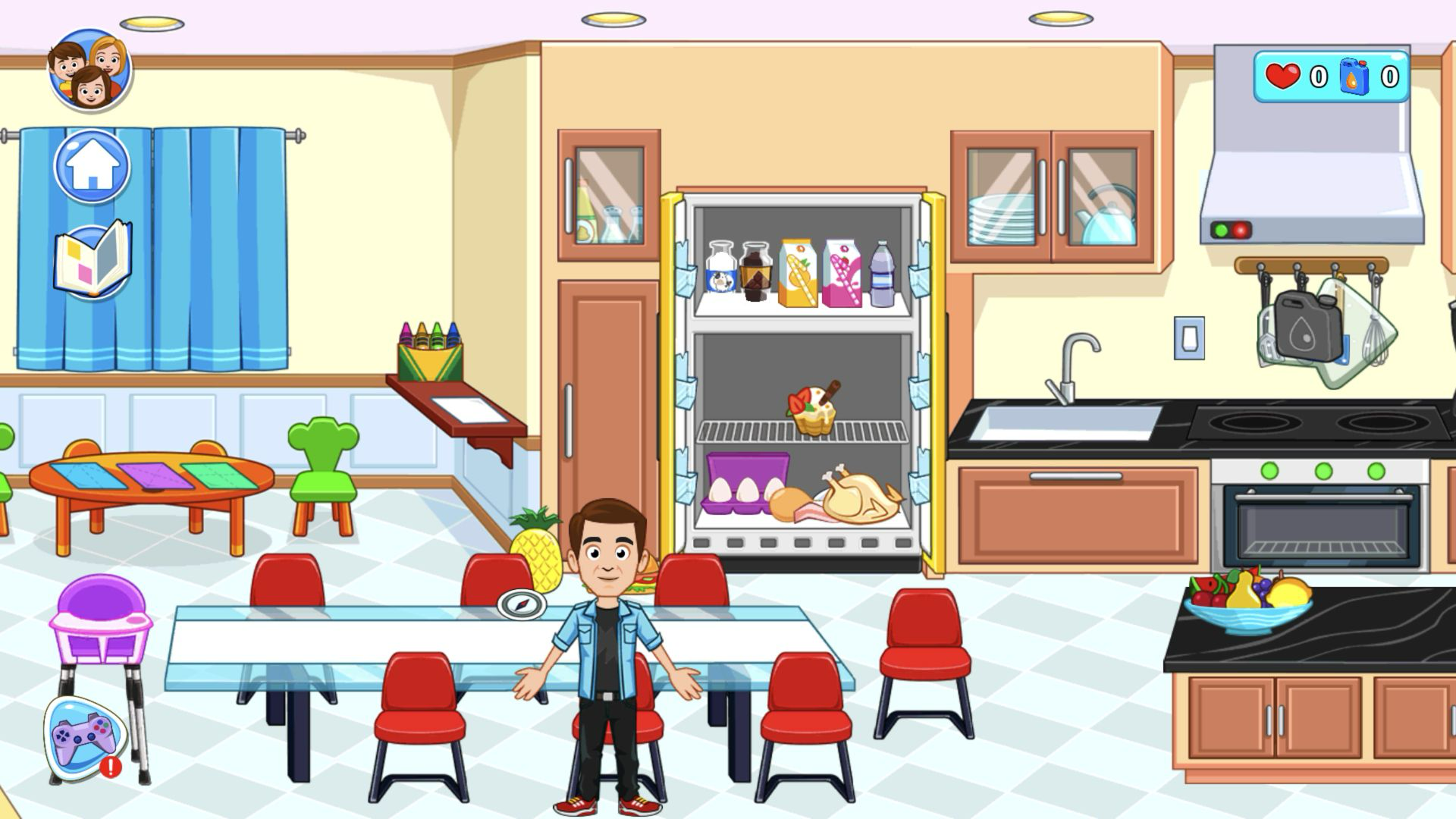
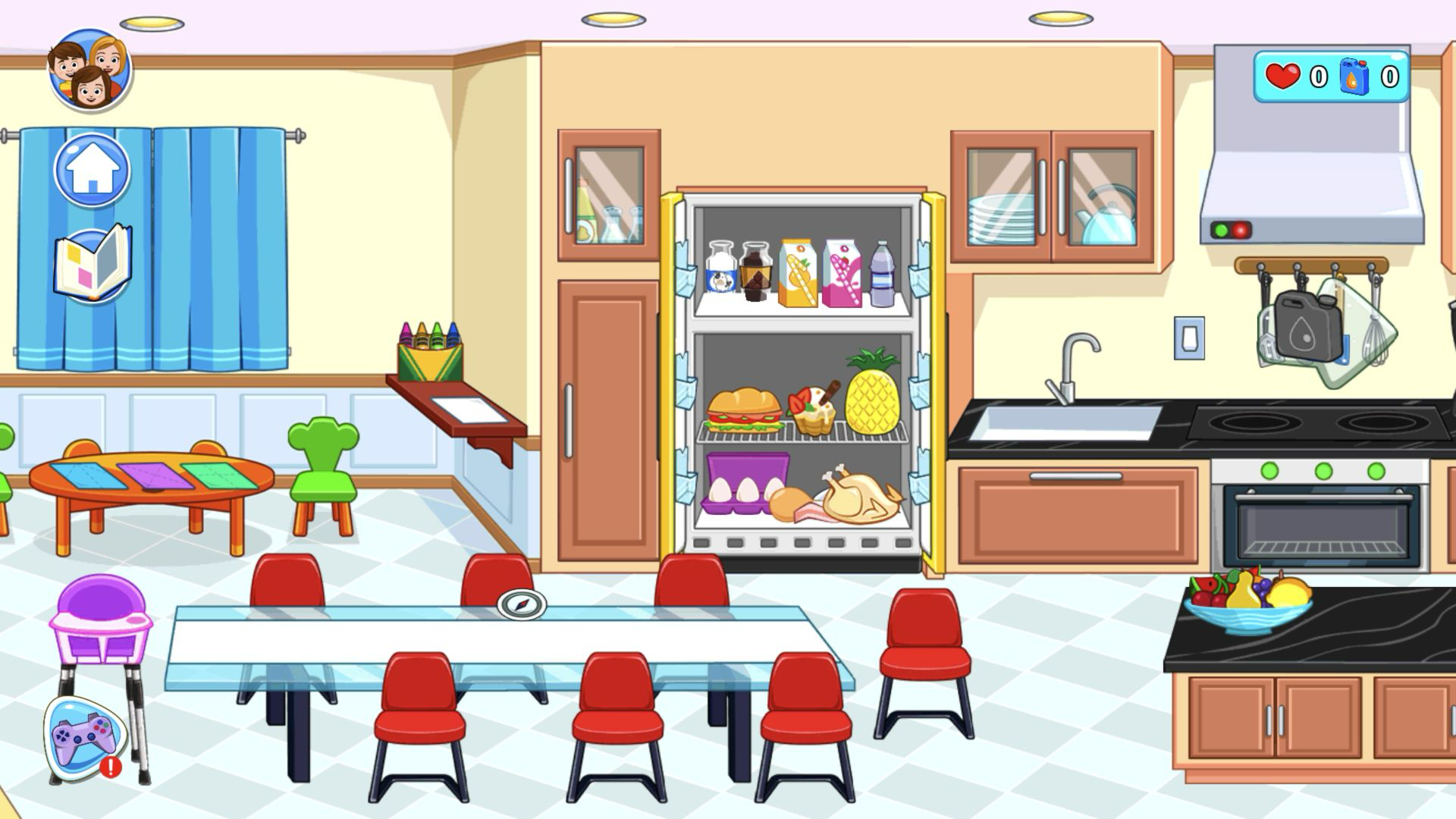
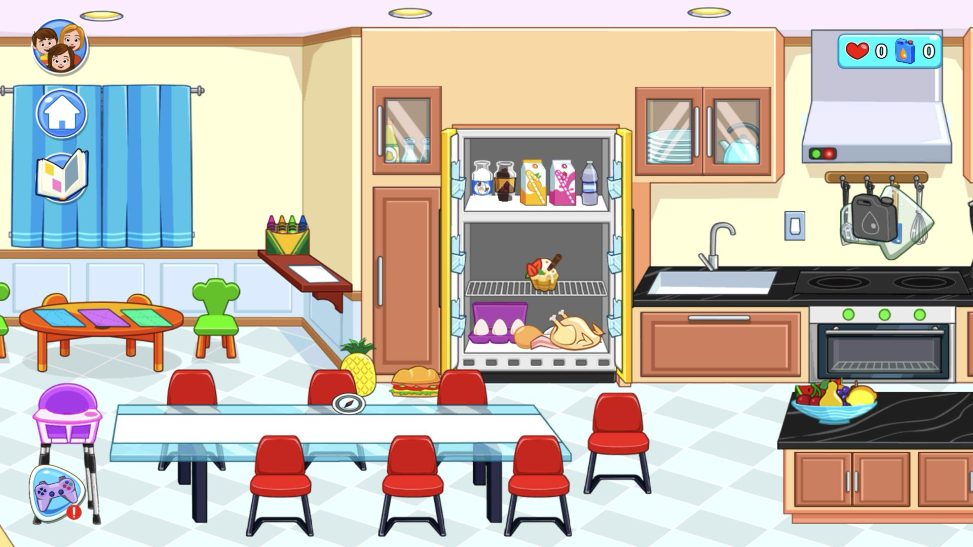
Moving right brought me into the kitchen, where opening the refrigerator produced the most satisfying cause-and-effect in the session. Drinks filled the upper shelf; a sandwich, dessert, and pineapple occupied the middle; eggs, bread, bacon, and a roast chicken sat below. These are not tiny background decorations. Their large shapes invite dragging, and the empty dining table provides an obvious destination even though no character gives an order.
I chose the pineapple and sandwich because they were visually distinct and easy to track. That choice exposed the main control frustration. The game uses generous hit areas, which helps when selecting large cartoon objects, but overlapping targets can make a drag catch a neighboring prop or person. Slower starts from the center of an item worked better than grabbing near its edge. I never needed a keyboard command; the whole kitchen sequence used pointer clicks and drags.
A pineapple, a sandwich, and one seated parent complete the scene
Both foods stayed on the glass table after I dragged them from the refrigerator, so the room clearly reflected my choices. I then opened the round family portrait control, selected the default father from the character drawer, and positioned him in front of a dining chair. The final kitchen frame—open refrigerator, prepared food, and father at the table—was my honest result rather than a score screen or scripted ending.
That outcome explains who will enjoy the game. It suits players who like arranging characters, inventing domestic stories, and testing which household objects respond. It is less likely to satisfy someone looking for fail states, optimization, or a visible campaign result. The house provides the ingredients, while the player supplies the reason they matter. My small lunch story felt complete because each earlier action remained visible in the final arrangement.
The 390x844 modal works, but the horizontal rooms become a narrow window
I also entered through the local page's Play button at a 390x844 pointer viewport. The game opened in Playflaming's fullscreen modal, identifiable by the back control at the top and title footer below the player. I repeated the arrival-and-room-navigation flow and observed the daily 50-heart reward state. The tall viewport kept the characters readable, but because the catalog declares a horizontal orientation, only a narrow portion of each wide room fit on screen at once.
This was a browser pointer test, not proof of touch behavior on a physical phone. It verifies the local modal route, portrait framing, and comparable navigation loop, but it does not justify claims about touch responsiveness, battery, heat, or real-device performance. I therefore cannot name a best device from this session. The practical takeaway is narrower: desktop showed the complete rooms at once, while the tested 390x844 modal required more side-to-side navigation. I also left the ad-marked gamepad and Get Free prompts untouched.
