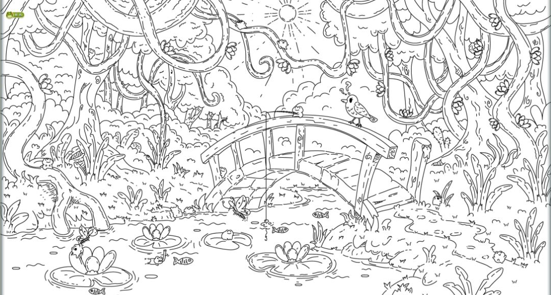
My first swamp search ended 10/10, but not flawlessly
I finished the opening swamp level with all 10 frogs found, three of the original five hearts left, and a much better respect for how cleverly the drawing disguises its targets. The first frog is deliberately easy: the tutorial circles it, a click turns its body green, and the game then teaches mouse-wheel zoom. After that gentle introduction, the scene becomes a genuine visual search. Rounded stones, mushroom caps, lily pads, insects, curled roots, and tufts of grass all borrow parts of the same silhouette language as the frogs.
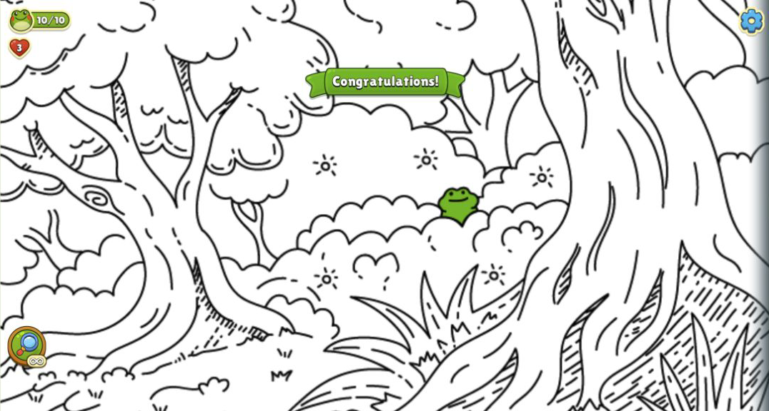
The two lost hearts were my own errors. One came from clicking slightly outside a highlighted frog after the camera had shifted; another came from trying to restore focus in empty scenery. Each wrong click immediately reduced the heart counter, so random tapping is a poor strategy even when a shape looks plausible. The 10/10 Congratulations! banner still appeared, and the collection screen advanced to Swamp frog 1/3. That imperfect finish is a fair picture of the game: relaxed in pace, but not consequence-free.
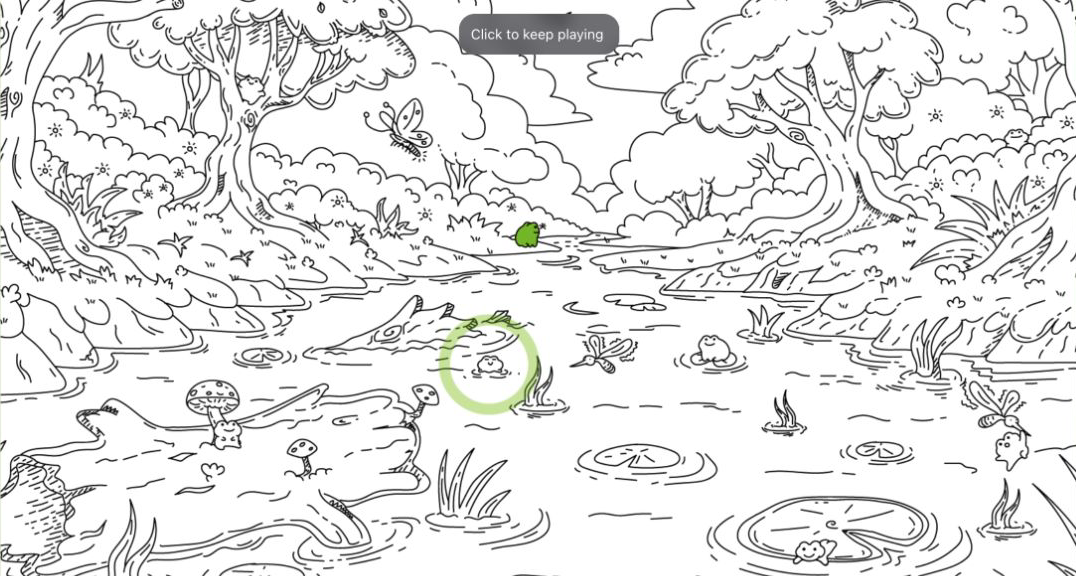
Green frogs make a monochrome scene readable
The strongest design decision is also the simplest: everything begins as black line art, while a confirmed frog fills with bright green. That contrast delivers a small burst of satisfaction on every correct click, but it also has a practical use. By 4/10, the green frogs acted like map pins. I could see which part of the pond had already paid off and move toward untouched clusters of detail rather than rechecking the same lily pad.
The illustrations are dense without looking muddy. Thin outlines remain legible, and each frog has a distinct pose rather than being the same icon stamped around the map. One hid as a rounded creature on a lily pad, another clung to a tree, and another sat among high leaves. The difficulty comes from visual camouflage, not tiny hit boxes. When I clicked the center of a clearly identified frog, both mouse and mobile tap input registered reliably.

The magnifying glass solves a search, then asks what the shortcut is worth
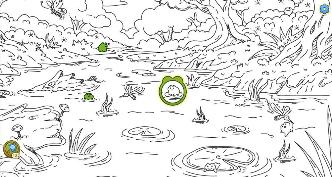
The magnifying-glass hint is unusually direct. It pans and zooms the camera to a target, then surrounds the frog with a thick green ring. There is no vague sparkle or broad search zone; the answer is explicit. That made it useful for understanding the artist's tricks, especially when a frog's back echoed the curve of a branch or its eyes blended into flower centers.
The cost became clear in the mobile Level 2 run. That level began with three hints, but the 15-frog objective outlasted them. Once the stock reached zero, the hint button changed to an AD badge. Each rewarded advertisement restored one hint, and I used ten one-hint refills to complete the evidence run. Some ads ended automatically; others needed Skip and then Close Ad. I never had to log in or purchase anything, but these interruptions were far more disruptive than the calm search. Players who dislike rewarded ads should treat hints as a last resort and preserve them for the final few targets.
Portrait touch controls work, but the scene becomes a memory test
I tested the mobile route through Playflaming's own Play button, not through a direct game URL. The 390 by 844 fullscreen modal kept a white back control visible at the upper left and the game title strip at the bottom, confirming that the search was happening inside the required player. Taps selected frogs cleanly, and dragging moved the enlarged illustration. The complete Level 2 loop ended at 15/15 with four hearts remaining, then advanced the collection to Swamp frog 2/3 and unlocked Level 3 marked Hard.
The compromise is overview. On desktop I could compare the bridge, water, canopy, and reeds in one frame. In portrait, I saw a narrow slice and had to drag between distant areas. That turns spatial memory into part of the challenge: was the curved branch already checked, or did it only resemble one from another part of the map? The touch interface itself is sound, but the wide art naturally favors a wide display.

What I would do before spending another heart
My best beginner rule is to scan in bands before zooming. Start with the horizon and canopy, move through trunks and bridge rails, then finish at water level. Look for paired eyes and small feet, but do not assume every round outline is a frog. Once you zoom, use already-green frogs as anchors and pan in a consistent direction. That routine would have prevented both of my desktop mistakes and the single mobile error.
Save the magnifying glass until the remaining counter is low. A hint is most valuable when only one or two frogs remain and the searched area is already familiar. On mobile, deliberately drag far enough that each new slice has a clear landmark; tiny nudges make adjacent views blend together. Above all, click the body rather than the edge of a highlight ring. The hit detection was fair in my runs, but a near miss still counts as a mistake.
A charming hidden-object game that is better with room to scan
Find the Frog - Hidden Objects is at its best when the artwork is allowed to fill a wide screen. Desktop is my recommendation from the tested comparison because it exposes more of each composition, makes scene-to-scene memory easier, and supports precise scanning without constant panning. The mobile fullscreen version is fully playable and its tap controls are dependable, but the portrait crop adds navigation work that is separate from actually recognizing a frog.
Children and casual hidden-object fans should enjoy the friendly drawings, immediate green reveals, and collection progress. More experienced players can ignore hints and treat each illustration as a careful observation test. The main reservation is monetization friction around extra hints: in my mobile run, finishing with assistance meant repeatedly leaving the calm line art for rewarded ads. If you can accept that trade or play patiently without shortcuts, the core search is distinctive, readable, and genuinely satisfying when a supposed leaf suddenly turns into a frog.
