The first purchase immediately became a budgeting lesson
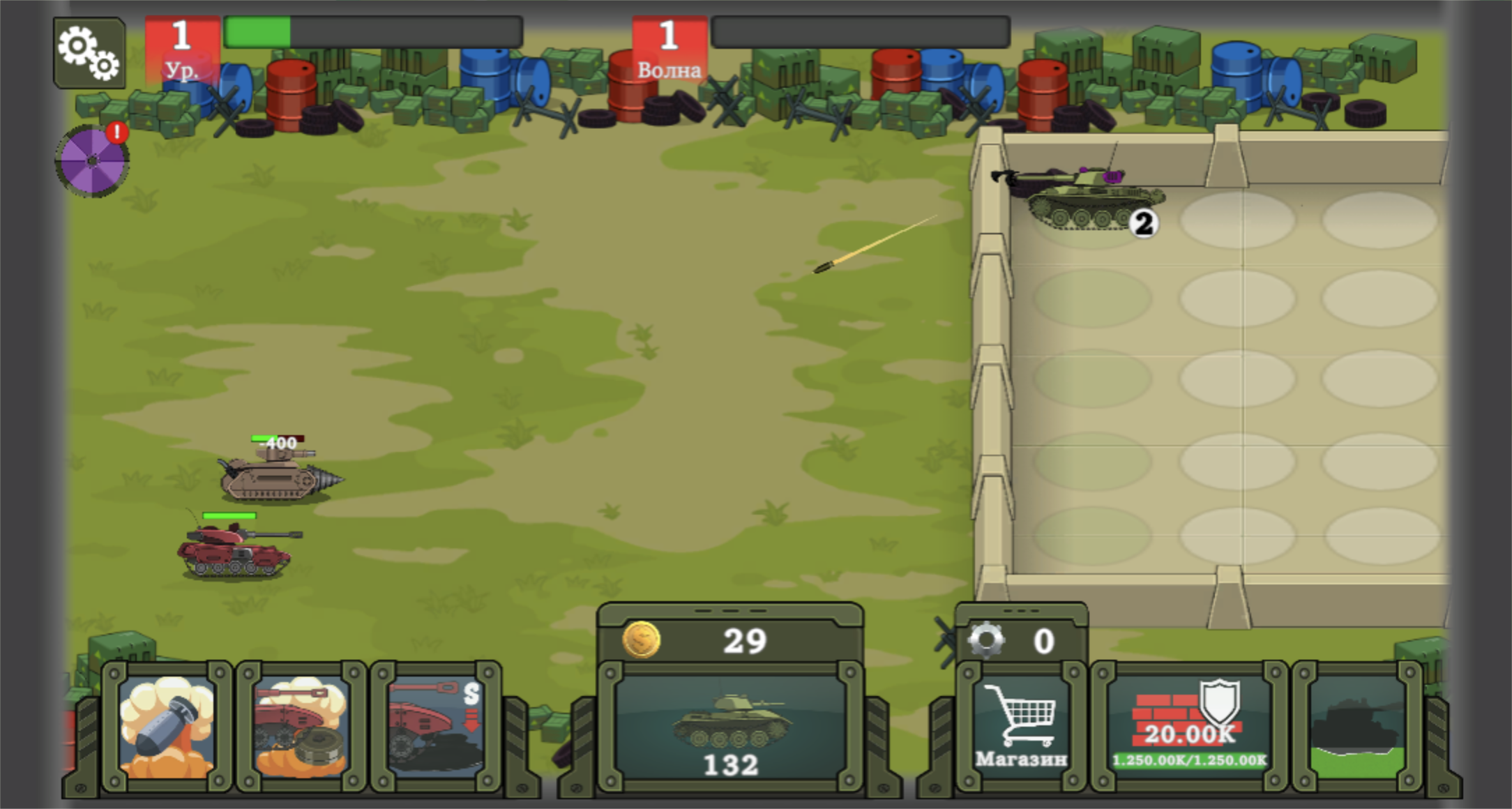
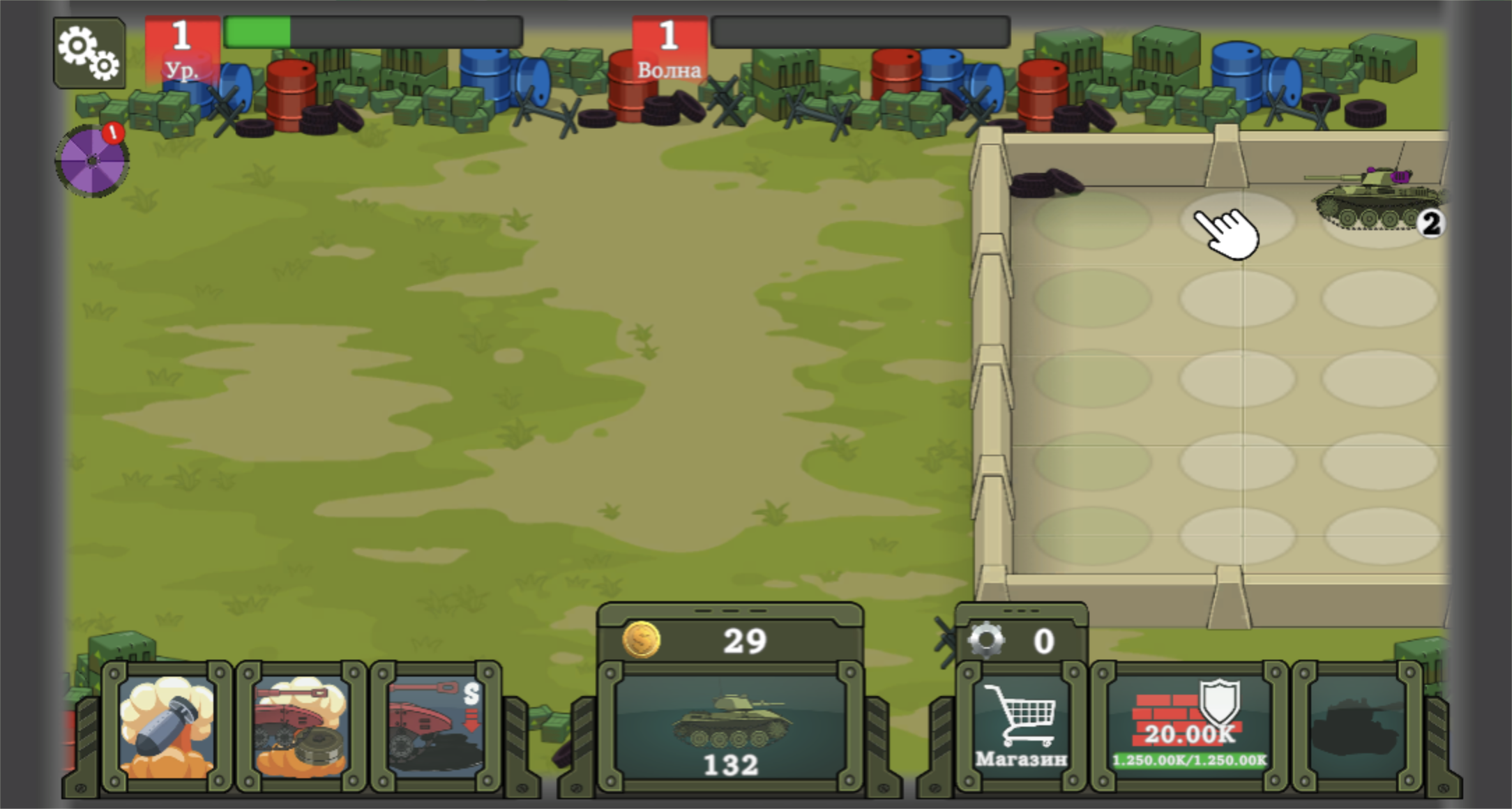
My run began with the game pointing at the tank card along the bottom of the screen. The first level-one vehicle cost 100 coins. The next copy cost 115, and the counter fell to 29 after both purchases. That small increase matters because the battlefield is also your garage: every new unit takes a circular slot in the concrete hangar on the right, and buying blindly would fill space without necessarily improving the firing line.
The interface communicated most actions with a large hand cursor rather than a long explanation. I could drag a tank between hangar slots, but movement alone did not improve it. The useful action was to place one identical tank directly over the other. This is a simple opening, yet it teaches the central choice clearly: keep more weak barrels or compress them into one stronger machine.
Merging the pair unlocked a 400-damage tank
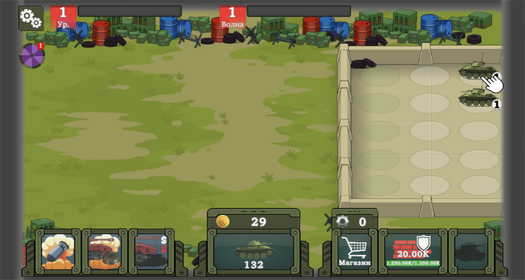
Dropping the two matching vehicles together triggered a full-screen unlock card for a new tank. The resulting unit carried a level-two badge, and the panel listed 400 damage. That was the most concrete power number in the opening tutorial, so I treated it as the baseline for the first defense rather than assuming the visual change alone meant a large upgrade.
The merge animation was readable, but the language was not ideal for this session. The game itself loaded with Russian interface text even though the surrounding Playflaming page was in English. Icons, arrows, numbers, and the tutorial hand made the opening playable, but players who rely on written explanations may need a moment to decode the result and reward panels.
Deployment is positional; shooting is automatic
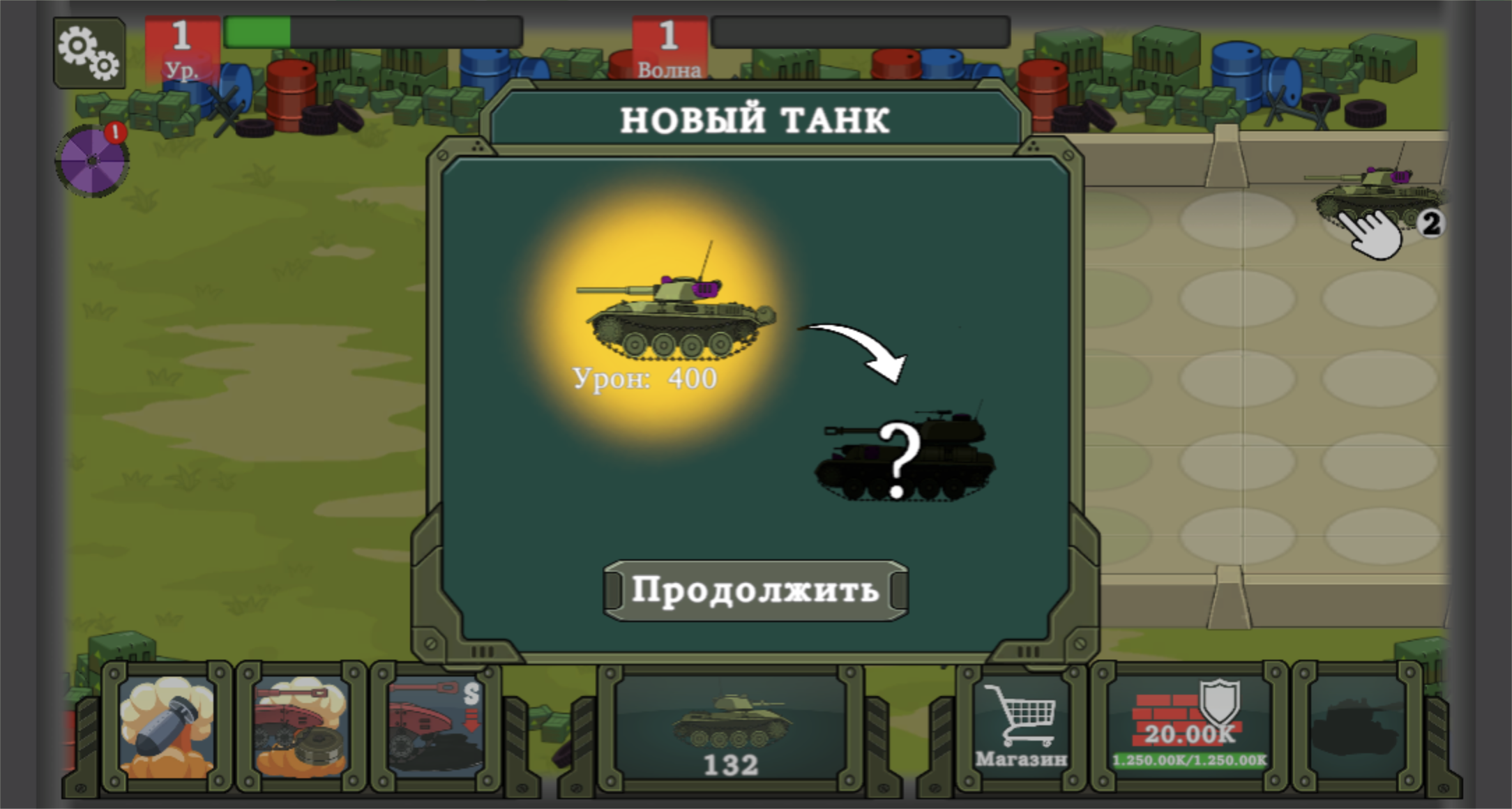
The game did not ask me to steer the tank or aim each shot. I placed the level-two unit in the upper-left hangar slot, and it began firing across the open field when enemy armor entered range. This makes Defender: Tanks Merge closer to an army-preparation game than an action shooter: the important inputs happen before and between exchanges, while the actual gunfire plays out automatically.
That automation gives the opening a relaxed rhythm, but it also limits recovery once a wave is underway. I could watch health bars and projectile travel, yet I could not manually focus a dangerous target. The practical beginner lesson is to finish merging and arranging before the wave bar advances, rather than expecting quick aim to repair a weak setup.
One merged defender was enough for Wave 1
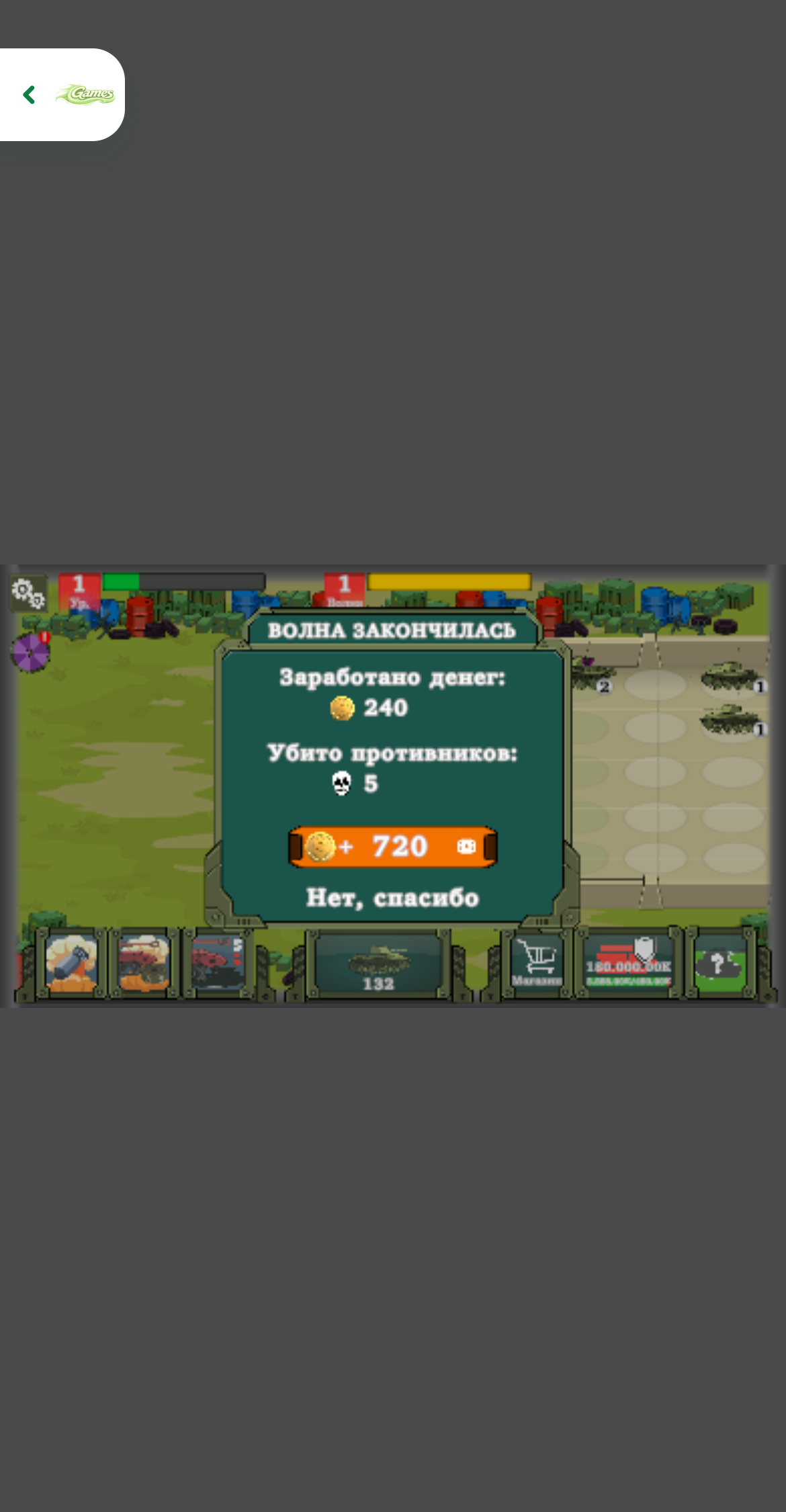
Wave 1 sent small enemy tanks in from the left. My level-two defender repeatedly fired from the hangar while the attackers crossed the grass. The exchange was easy to follow because each tank had a short health bar, shells remained visible in flight, and damage numbers appeared above targets. The wall survived, and the post-wave panel credited five enemies defeated.
The result awarded 240 coins. An orange video button offered an additional 720 coins, while the plain text option underneath declined it. I chose the no-thanks route for the test. The optional reward was prominent, but the game did not force me to watch it to claim the base payout or continue.
Gears and wall health create the second upgrade track
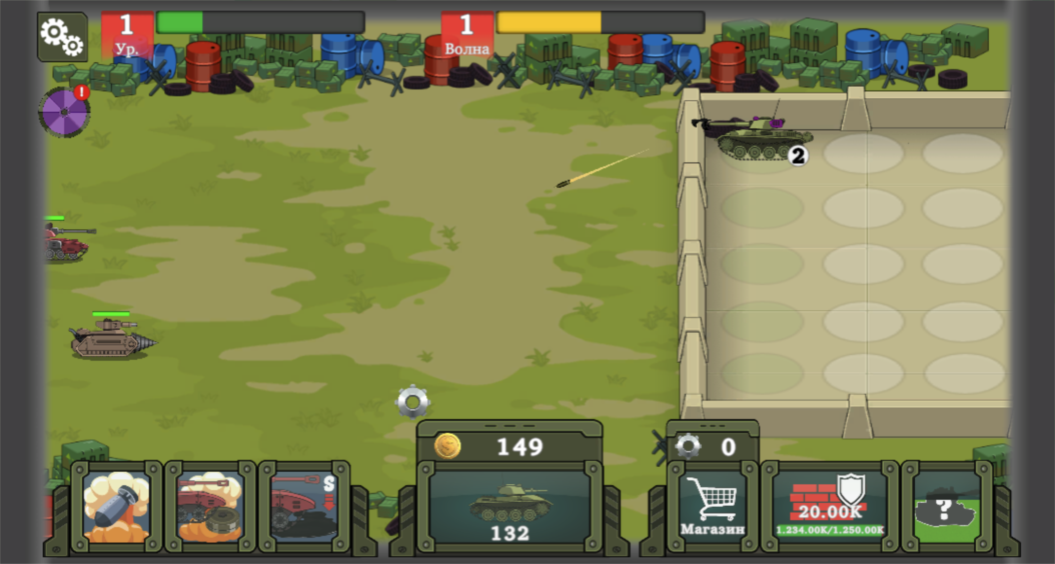
Clearing the first wave did more than refill the coin counter. A tutorial overlay introduced gears as a separate upgrade currency and pointed toward the store area. During the next combat state, a silver gear appeared on the field while the tank continued firing. That second resource suggests a longer loop built around improving permanent systems as well as buying disposable copies for mergers.
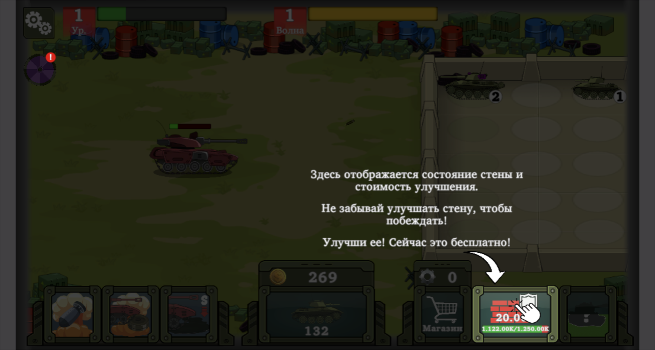
The wall panel at the bottom right showed its current durability and upgrade cost. The tutorial granted the first wall improvement for free, which was a sensible demonstration because it exposed the defensive layer without demanding another purchase immediately after the opening tank expenses. It also clarified that damage output is not the only upgrade concern: the barrier has its own durability to protect, although this test did not reach a wall-loss result.
The wall tutorial was useful, though visually crowded
The upgrade prompt darkened most of the battlefield and placed several lines of Russian text over the hangar. Its arrow clearly identified the brick-and-shield panel, so I could complete the step, but this was the moment where the untranslated interface created the most friction. The bottom HUD already contains three ability cards, the tank shop, gear count, wall health, and another locked panel; adding a large tutorial block made the screen busy.
Once the overlay cleared, the system itself was straightforward. Coins buy new level-one tanks at a rising price, matching tanks merge, gears feed store upgrades, and the wall is a separate survival investment. Players who enjoy incremental planning will find several numbers to optimize. Anyone looking for direct tank control should expect observation and preparation instead.
Mobile fullscreen worked, but desktop was easier to read
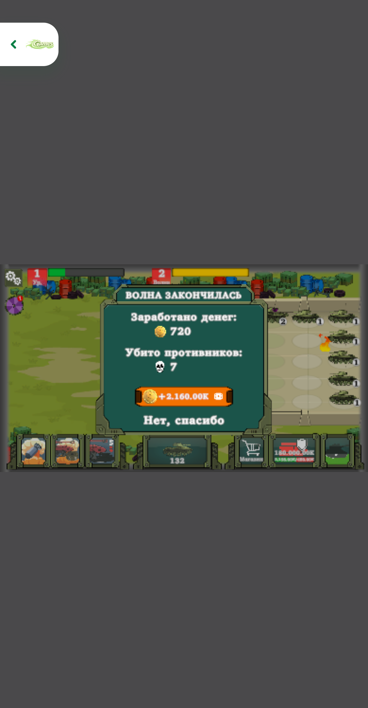
I also opened the local Playflaming route at a 390 by 844 touch viewport with device pixel ratio 3, tapped Play, and used the fullscreen modal player identified by its visible Exit game control. The same merge-and-defense loop responded to touch. I completed Wave 1 again for 240 coins and five enemies, then continued through Wave 2, which reported 720 coins and seven enemies defeated.
The game remained landscape inside the portrait player, leaving large unused bands and making Russian labels and small HUD numbers harder to read. Touch dragging still worked, but the wider desktop capture gave the hangar, health bars, and upgrade panels much more room. Based on those comparable clears, desktop is the clearer way to learn the systems; mobile fullscreen is functional for a quick wave when precise reading matters less.