My First Match Reached a Third Round — Then Stalled
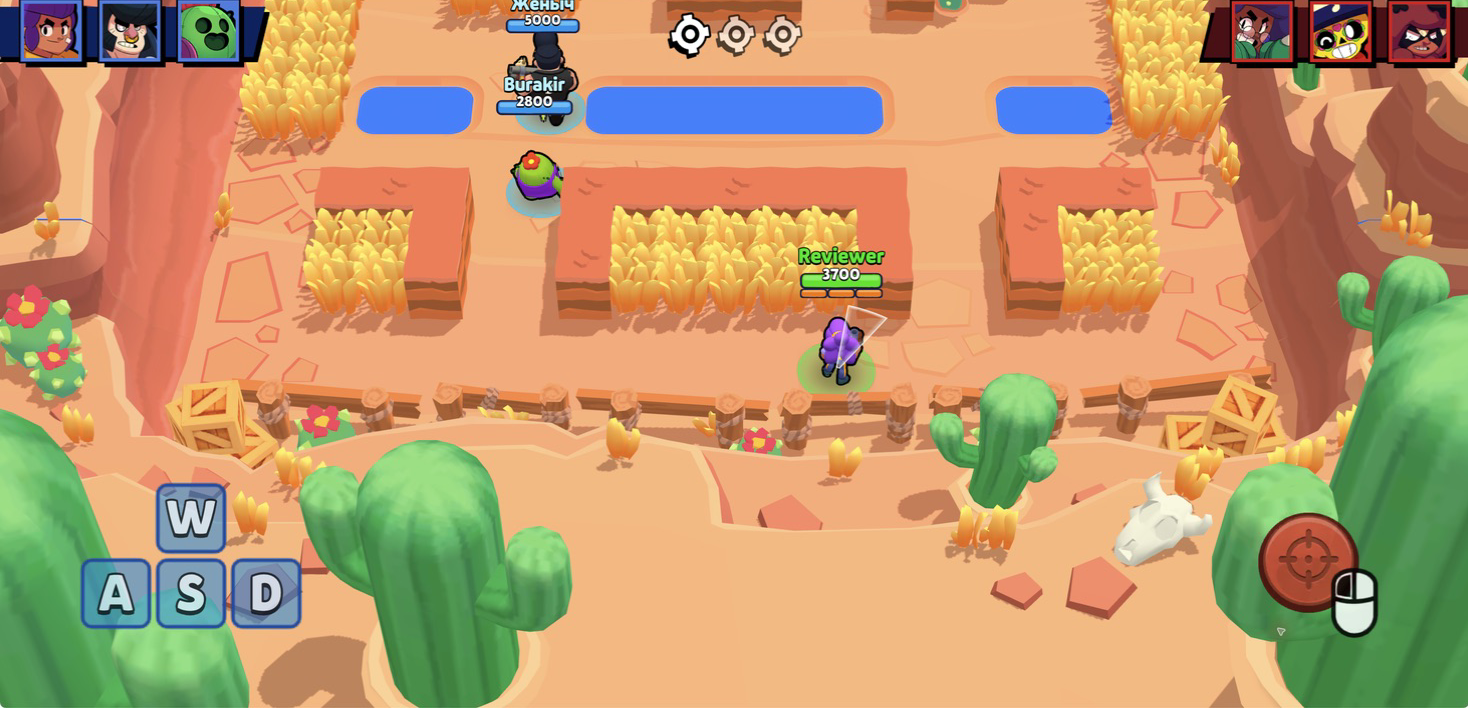
I started Brawl Simulator 3D with a fresh profile named Reviewer and went straight into Knockout on Goldarm Gulch. The opening team screen gave my Shelly 3,700 health and three orange ammo segments, while the top corners showed three portraits for each side. There was no account requirement in this session, and the large yellow play area sent me from the character hub into the arena after a short black loading screen.
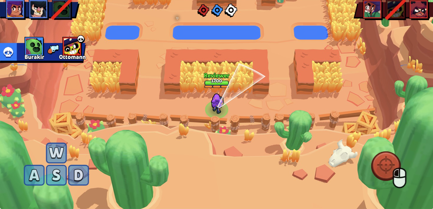
The match used a clear best-of-three structure. My team lost the first round, recovered to win the second, and lost the deciding third round, leaving the center markers red, blue, red. I therefore finished my first desktop match with a 1–2 loss. That result was not caused by a hidden rule: each round ended when all three portraits on one side were crossed out, and defeated players stayed out until the next round.
The awkward part came after the decision. Instead of a readable defeat panel, scoreboard, or reward screen, the tested build remained on a blue transition background with the final round markers still visible. I waited, clicked once, and eventually reloaded the page. The hub returned with zero trophies, zero coins, and zero gems, so I did not claim a reward or progression result that the game never clearly presented.

Shelly's Three Shots Make Cover Matter
Goldarm Gulch is built from short lanes, low red walls, rectangular pools, tall grass, crates, fences, and large decorative cacti. The bright sand makes characters and health bars easy to track, but the grass can hide movement until someone steps out. I had enough room to approach from the bottom, pause beside the central cover, and point Shelly's broad white aiming cone toward the upper lane.
Desktop movement uses WASD, while the mouse sets the firing direction and the left button releases a shot. The inputs responded immediately in my test. Shelly's three ammo segments are the more important limitation: firing repeatedly spends them quickly, so walking into the open without a charged shot leaves very little room to correct a bad approach.
My first-round mistake was rushing forward and firing toward a distant target before I had a clean lane. The opposing side survived long enough to remove all three members of my team. The second round went better when I used the grass and wall edge as a staging point instead of crossing the middle immediately. The practical beginner lesson is simple: aim before leaving cover, spend one shot to test the lane, and keep enough distance to retreat while the ammo bars refill.
Desktop and Touch Feel Different for a Real Reason
I also tested the declared mobile experience in an emulated iPhone 14 Pro Max landscape viewport. The game replaced the keyboard prompt with a large blue movement joystick on the lower left and a red aiming joystick on the lower right. Dragging the left stick moved Shelly up the lane, and dragging then releasing the red stick aimed and fired. This was a genuine touch-emulation test of input and layout, not a claim about battery use, heat, or real-phone performance.
The comparable touch round loaded Knockout on Flaring Phoenix. My side eliminated all three opponents while none of our three portraits were crossed out, so the tested round was a win. The same transition problem appeared immediately afterward: the arena faded to the blue result background and did not advance to the next readable state during the test window.
Of the two tested control schemes, I preferred desktop for combat. The mouse made small aim corrections easier, and the arena remained less obstructed than it did with two large translucent joystick zones covering the lower corners. Touch was fully usable and the wide landscape layout preserved the battlefield, but the controls demanded broader gestures at exactly the moment I wanted precise direction.

The Collection Starts at One Brawler Out of Eighteen
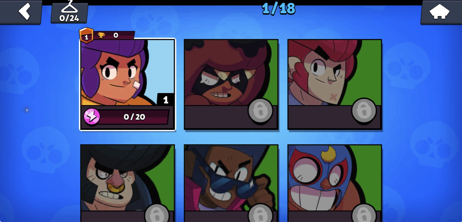
The collection page makes the long-term goal visible immediately. My new profile showed 1/18 at the top, Shelly as the only unlocked card, and lock symbols across the other visible brawlers. Shelly was level one with zero trophies and 0/20 on the purple upgrade meter. A hanger counter in the corner read 0/24, linking the brawler roster to a separate skin collection.
That structure gives the short arena matches a purpose beyond winning one round. New characters, upgrades, trophies, skins, boxes, coins, and the green star currency all have visible places in the interface. The drawback is that the hub exposes almost every progression system before the first match has successfully paid anything out, so the first impression is broader than the progress I could actually verify.
Skin Previews Look Better Than Their Unlock Explanation
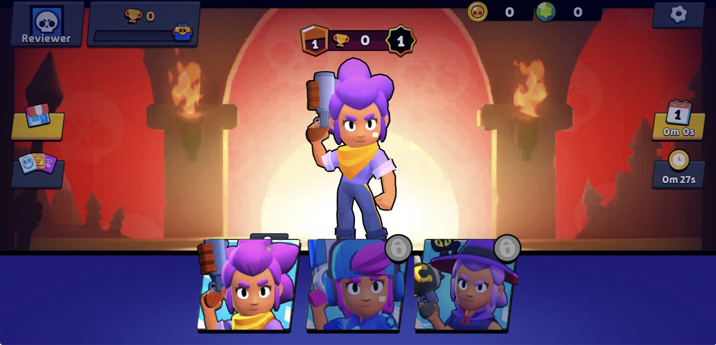
Opening the hanger pulled a skin drawer up over the lower half of the hub. The default Shelly portrait was available, while the blue headset outfit and a darker hat-and-cat variant carried lock icons. Clicking a locked portrait changed the large character model for preview, which is a useful way to inspect the outfit without pretending it has been unlocked.
What the panel did not show was equally important. I saw no readable requirement, price, or button explaining how either locked skin becomes available. The presentation is polished enough to create interest, but the next step is vague. I would rather see a trophy target, currency cost, or box source directly on the selected card.
The Box Shop Is Bright, Aggressive, and Missing Key Labels
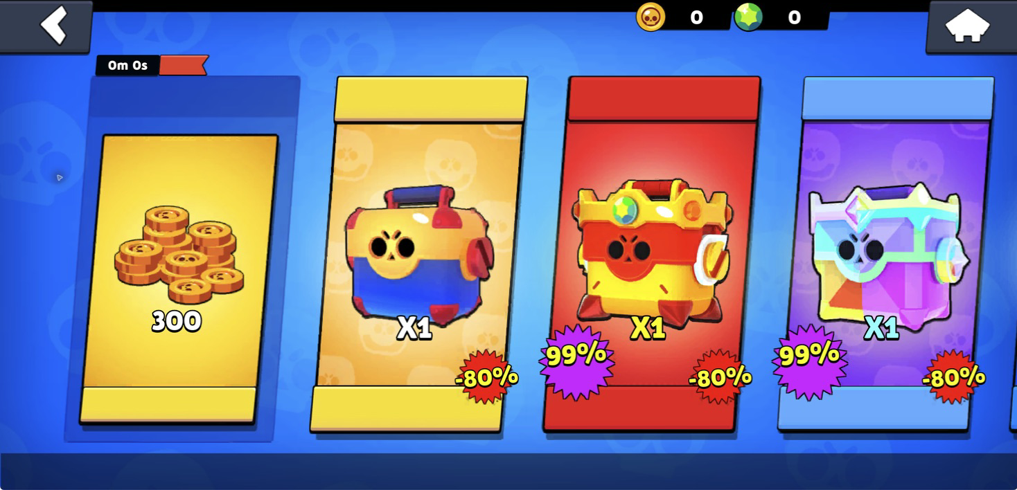
The store is the loudest screen I opened. One card displayed 300 coins, and the neighboring offers showed a regular box, a red trophy-style box, and a multicolored box, each marked x1. Large -80% and 99% bursts overlap the cards. The catalog metadata declares in-game purchases, but I did not buy, open, or claim anything during this review.
In the tested build, the offer cards were missing readable price text and the small timer above the first column read 0m 0s. That makes the sale graphics more prominent than the actual transaction information. The main hub also used large blank yellow areas where a clear Play or claim label would have helped. These missing labels do not stop a match from starting, but they make the surrounding economy feel unfinished.
The Quest Screen Exposed the Roughest Edges
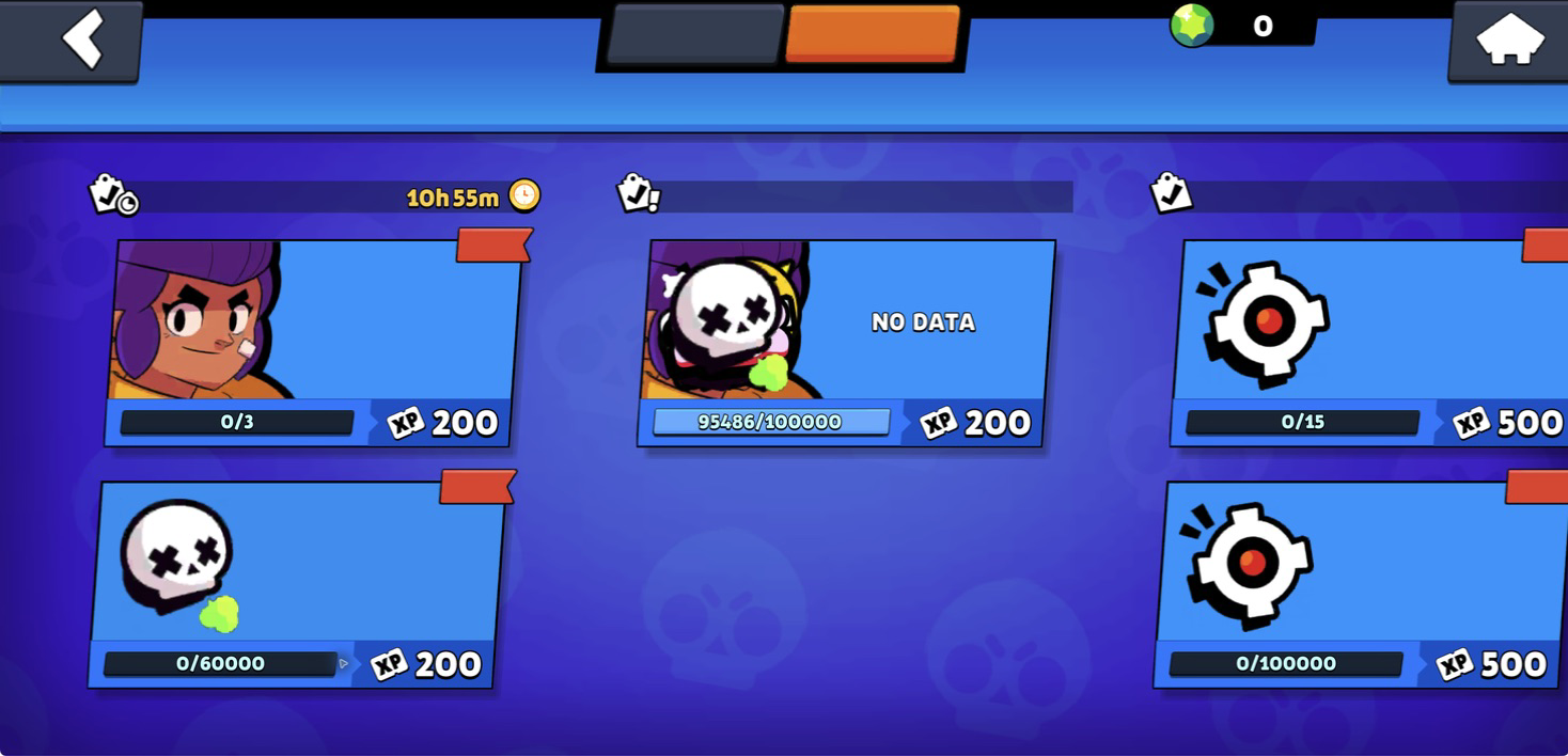
The quest page contained several measurable goals: 0/3 for 200 XP, 0/15 for 500 XP, 0/60000 for 200 XP, and 0/100000 for 500 XP. Another card showed 95486/100000 and 200 XP. A timer at the upper left read 10h 55m. Those numbers suggest daily and larger progression objectives, but the objective text was not consistently present.
One card literally displayed NO DATA, the two top tabs had colored shapes without readable names, and several red ribbon labels were blank. Combined with the stalled round transitions, this was the clearest evidence that the tested build needs interface cleanup. The combat loop is readable; the progression layer often asks the player to infer what a number or button means.
My Honest Verdict
Brawl Simulator 3D has a stronger arena core than its rough menus suggest. The desert maps are colorful and easy to parse, the three-shot rhythm discourages thoughtless firing, and Knockout creates tension because a mistake removes you for the rest of the round. I enjoyed the 1–1 comeback in my desktop match and the clean elimination win during the touch test, even though neither session produced a proper post-result screen.
The biggest problem is reliability and clarity outside the fight. Both tested environments stalled on a blue transition after a result, while the store, hub, skin panel, and quest page all contained blank or incomplete labels. The visible collection and cosmetic systems give returning players goals, but the game needs to explain those goals and complete the reward handoff consistently.
I would recommend this to players who want a quick, solo-friendly approximation of three-versus-three Brawl-style combat and can tolerate an unfinished progression interface. Start with desktop if you have the choice, use grass and wall edges before spending Shelly's three shots, and treat the first session as a test of the arena rather than a promise that every reward screen will work.